Why you shouldn’t overlook user testing methods in UX design

The fundamental purpose of user testing is to better understand and empathize with the core users of a digital product. Unfortunately, user testing is often an afterthought.
From card sorting to usability studies, user testing methods utilized in UX design are developed to include the user in the decision-making process. However, many projects are completed with only stakeholder feedback of a prototype. This lack of user experience testing occurs for two reasons: the perceived negative ROI of user testing coupled with the concern of scope creep.
The perceived ROI on user testing methods
From a designer’s perspective, the implementation of usability studies needs no reinforcement. Any UX designer who has ever watched people struggle to perform tasks using their prototype understands the value of user testing. Unfortunately, most executives, engineers, and project managers have never had the privilege of witnessing a usability test, so will likely need to be convinced of user testing’s importance in another way.
Data proves the increase in ROI
Usability is directly tied to customer loyalty and purchasing behaviors—studies conducted by Jakob Nielsen from the NN/g suggest that when roughly 10% of a redesign budget is given to user testing methods, there is an average product usability increase of 135%.
Enterprise case study
When users can easily find the information they’re looking for on their own, it decreases frustration and improves their experience.
Millions of users visit the support site on Mozilla Firefox each year. Many visits turn into questions asked on the support forum. With a design optimized for discoverability, within nine weeks of iterative design testing, Mozilla reduced support questions by 70%.
Retail case study
The international paint company, Dulux, knew the primary issue with selling paint online involved the question, “What will my wall look like when the paint dries?” To get around this, they conceptualized an augmented reality app called Dulux Visualizer to help consumers “picture it before you paint it” and hired Webcredible to build the application.
Through user research, user journey mapping, and usability testing, the Webcredible team produced an app that increased tester paint sales by 65% and stockist searches by 92%.

Scope creep aversion
The second reason user testing is overlooked is less about the executive and more about the project manager. Almost every designer has heard a project manager say that due to a tight deadline there is no time for user testing.
Project managers understand only three components that matter on a project: time, cost, and scope. Pull on one and another will shift. For example, if more features are added to a project, the timeline will extend or more resources will be added. This is why when a timeline is set, a PM is reluctant to budge. Understanding this, designers can combat these tendencies with some UX education on the different methods available, their scope, and budget. Let’s look at an array of user testing methods UX designers can employ to evaluate the usability of digital products.
The many types of user testing methods
There are many types of user tests, from behavioral and attitudinal to qualitative and quantitative, each with a set number of participants for optimal results.
Attitudinal and behavioral testing is summed up as “what people say” vs. “what people do.” Many times the two are very different.
Qualitative and quantitative testing is described as “direct observation” vs. “indirect measurement.” Quantitative testing data will always express a certain quantity, amount or range, while qualitative testing data contains information about qualities.

Each of these terms falls under formative or summative. This quote from Robert E. Stake, Professor Emeritus of Education at the University of Illinois, sums it up nicely: “When the cook tastes the soup, that’s formative. When the guests taste the soup, that’s summative.”
Qualitative behavioral user testing
This type of user test observes what a small number of participants do in various situations, whether in their work environment going about their normal routine, or completing tasks within a recently designed prototype. These tests need the fewest number of participants and as such can be the easiest to convince a project manager to include.
What is the optimum number of participants in usability testing?
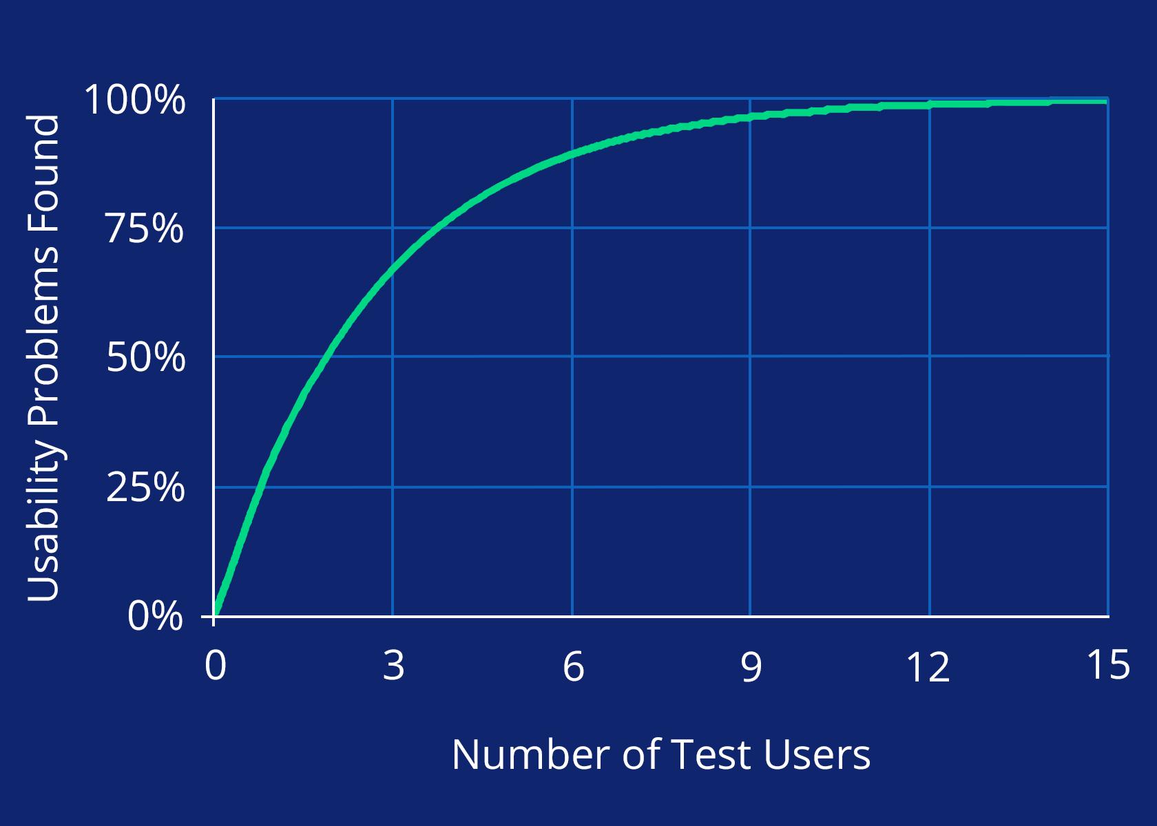
According to the book A Mathematical Model of the Finding of Usability Problems five usability testing participants will uncover 85% of the issues within the tested UI. For best results, this should be performed with three design iterations for a total of 15 participants.
Usability studies are often conducted in the middle of a project after initial design is produced. Rather than waiting until after a product has been launched to discover usability problems, the collected data can be used to improve the product when it’s simpler to make changes to the design spec.

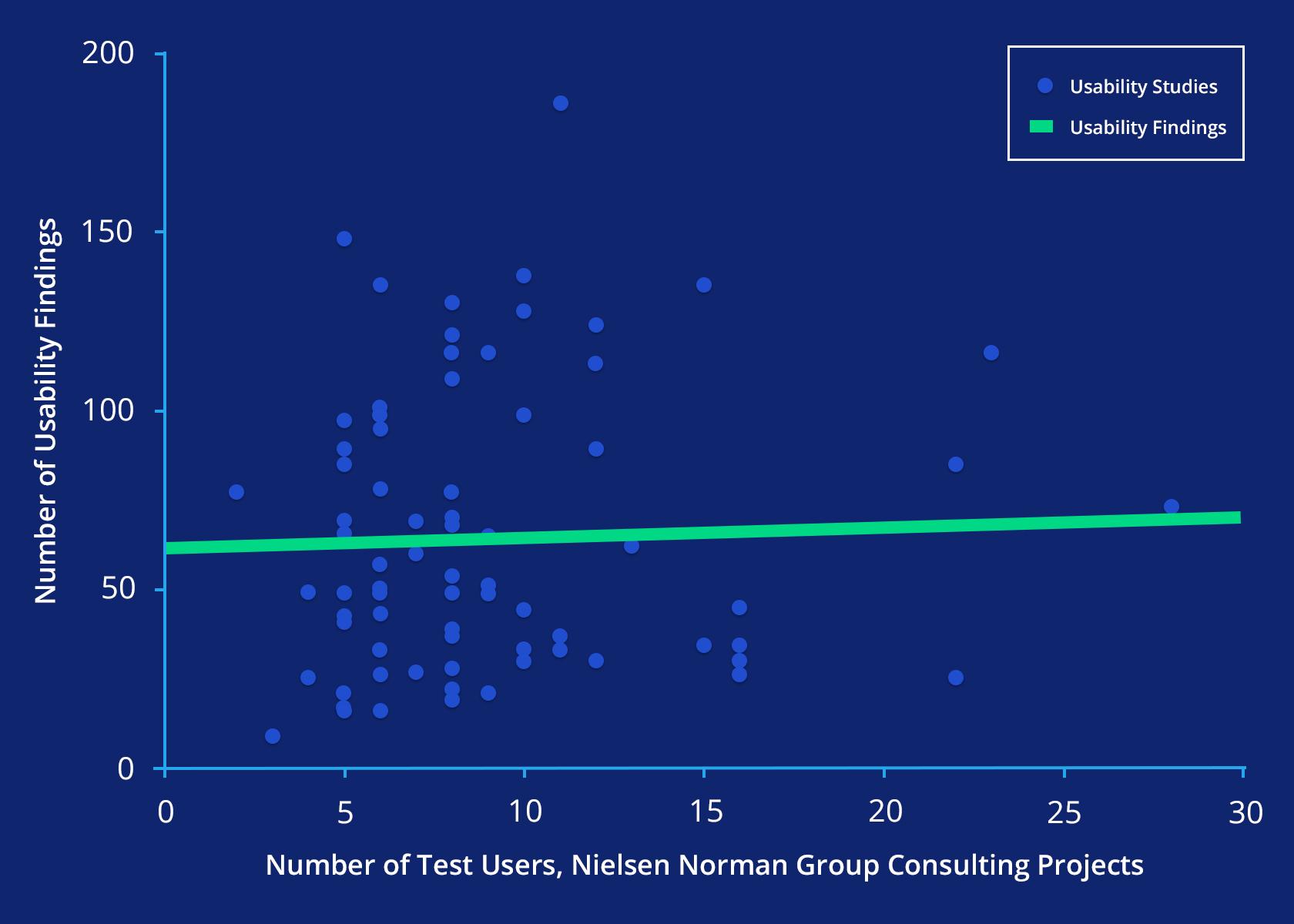
To land on the suggested number of five users per design iteration, the NN/g conducted 83 usability tests across different clients with studies ranging from 2 to 28 participants. The results showed a significant increase in repeated findings with only a few new findings after five participants. The most important conclusion is that all of the usability tests produced at least some insight.

12 users uncovered 33 issues when user experience testing
The developers of a new cancer survivor app contacted Marketade to conduct usability testing three weeks before their product launch date. Over a period of two weeks, Marketade conducted iterative usability testing with 12 users: 8 cancer survivors and 4 caregivers. Their usability tests found 33 usability issues, 9 of which were high-impact.
The biggest thing all of these case studies have in common is that small test groups can have a huge impact on the end usability of a product. Product managers, project managers, and other stakeholders can more easily be brought on board for user testing when shown that it doesn’t take hundreds of participants (and weeks of time) to gather meaningful results.
Qualitative attitudinal user testing
For this test, UX researchers investigate small groups of participants to understand how they feel about a product, architecture, or design. Qualitative attitudinal tests require a few more participants than qualitative behavioral studies, but not many more.
Card sorting
A study was conducted to understand the minimum number of required card sorting participants and found 15 users can quickly improve a light architecture through a card sorting exercise, while 30 participants are recommended for grander architectures like intranets and portals. Card sorting is often performed in the middle of a project after auditing the information architecture.
Focus groups
Recent research shows that 3 to 6 focus groups with 8 to 10 participants can identify 90% of themes within a dataset. These focus groups are typically conducted during the strategy phase of a project. There are many exercises to conduct with focus group participants, from participatory design exercises to open discussions.
Qualitative attitudinal example
The user experience company Etre undertook the enormous endeavor to improve the Eurostar information architecture. Their website contained 11,000 web pages and PDFs, of which 80 pages were fundamental to the architecture. Etre turned each core page into a card for a massive card sorting exercise. They understood the need for 20 participants per user group, however, with 9 user groups, their exercise included 180 participants, each sorting 80 cards, producing 14,400 items to catalog!
Fortunately, Etre leveraged an online card sorting resource that automatically sorted the data into digestible insights. While the card sorting exercise was only one component in a larger web design effort, Eurostar witnessed a 24% or £26 million increase of revenue over the previous year as well as a 2.2% increase in website traffic.
Quantitative behavioral user testing
For this study type, at least 20 participants are required and often times more. With quantitative studies, UX researchers are looking for patterns within the collected data, so the more participants, the more accurate the data.

Heatmaps
The NN/g found that 39 users are required to provide the needed heatmap details for eye tracking exercises. A minimum of 30 sets of good eye tracking data are necessary for each tested page, which averages out to 39 actual users in order to achieve that data set (since eye tracking technology isn’t perfect). Eye tracking for heatmaps is typically performed after a new design is executed.
Quantitative studies
At least 20 participants are recommended for quantitative studies. Like usability testing, these studies are performed to understand how a user behaves by completing a set of tasks. The difference is how the data is collected, which is through viewing remotely instead of one-on-one exercises. They are often performed towards the end after the product or an interactive prototype is hosted online.
Because these types of studies require more users, they can take more time and be more expensive to conduct. For that reason, they’re less commonly used than many qualitative user testing methods.
Increased user retention
Through the quantitative research site UserTesting, Evernote increased user retention by 15% across multiple devices. By hosting their product on UserTesting.com and leveraging their diverse audience, Evernote was able to understand where users encountered problems. Using these types of user testing tools is particularly valuable for products that have a broad audience where a diverse set of user feedback is helpful. Other solutions may work better for products with a very specific, defined set of users.
Quantitative attitudinal user testing
The most participant-heavy test is the quantitative attitudinal exercise. The goal is to understand what a large group of individuals think about a product, with the goal of compiling the answers into meaningful charts and graphs for easy consumption.
Surveys
Survey participants vary by the product population size. Optimal results include a 5% margin of error (or less) and at least a 95% confidence level. You can use a sample size calculator to determine the required number of participants.
For instance, a small site with a population size of 100 only needs 80 survey participants, while a popular site with a population size of 100,000 would require 383 survey participants. Surveys are conducted at both the beginning and end of a project.
Quantitative attitudinal example
While Walmart.ca collected plenty of statistical website data, without customer insights their data only told half of the story. By including human data through website surveys, along with their transactional data, Walmart was able to see the complete picture and improve their site layout which in turn increased their revenue by 13%.
Summary
Showing decision-makers hard data can convince them to dedicate resources to user testing. The user is the backbone of a product and the true purpose of user experience design; implementing some of the user testing methods outlined in this article in order to gather qualitative and quantitative data to prove what works and what doesn’t should be a top priority for every UX designer.
The Toptal Design Blog is a hub for advanced design studies by professional designers in the Toptal network on all facets of digital design, ranging from detailed design tutorials to in-depth coverage of new design trends, tools, and techniques. You can read the original piece written by Jeff Bryant here. Follow the Toptal Design Blog on Twitter, Dribbble, Behance, LinkedIn, Facebook, and Instagra


Comments
Post a Comment