Android 1.0 versus Android 9: A visual tour of how far we've come in a decade
Android has changed tremendously in the last ten years. Returning to modern hardware after our historical series, I was struck by the visual differences across versions. For a closer look, we rolled back to an even earlier build on our T-Mobile G1/HTC Dream. For anyone who might be curious, here's a quick visual exploration of Android 1.0 vs. Android 9 Pie. And don't worry, this isn't one of those godawful click-for-every-photo galleries, just a simple scroll as we stroll back in time.
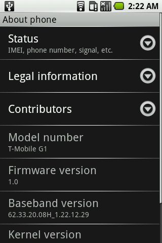
Initially, I halfheartedly planned on using the G1 for another week on Android 1.0, but ultimately decided that I had already spent enough time exploring Android history firsthand. Even so, one last flash was in order, so I rolled back all the way to R29 for a quick look at the first consumer-facing version of everyone's favorite mobile operating system.
For a more detailed exploration of the changes made in Android version-by-version, I encourage you to check out Ron Amadeo's rolling history of Android. It was last updated with Nougat, but it's still the authoritative chronicle of the operating system, and far more in-depth than this cursory visual and functional examination.
Home screen/Launcher
The default home screen and launcher have changed quite a bit over the years, though the modern eye can still pick out what it is at a glance. The T-Mobile G1/HTC Dream and Pixel 2 XL may be profoundly different hardware, but Android is still Android a decade later, and its most basic and recognizable features are still there. (Although one could argue that the Pixel Launcher isn't really a part of Android, it is the latest incarnation of Google's first-party intentions for the platform's home screen.)
Looks aside, at its most basic level it still functions the same: you get icons with text labels for apps on customizable pages, with optional widgets and a drawer filled with installed apps. Aesthetic differences like notification bar and text backgrounds have been modified plenty of times over the years, fonts have changed, the clock has slid over to the left, and status icons are a lot prettier now, but it's still Android.
But the consistency in design has changed quite a bit since 1.0. Google is now pushing for uniform but dynamic "adaptive" icon shapes — the sort of rigor Apple pressured with icons on iOS from the very beginning. Android 1.0 was a bit of a crapshoot on an app-by-app basis, but Android is much more consistent with its design language now — excluding YouTube, anyway, which doesn't seem to have any idea what it's doing.
The overall aesthetic in Android has changed pretty drastically from the bitmap-and-gradient filled 00's. Back then things like arrows and giant tabs were needed to make it abundantly clear that an element was interactive, and in what way. Now a left-justified hamburger menu implies an edge gesture, and the floating action button is a standard for "input/make a new thing."
Settings
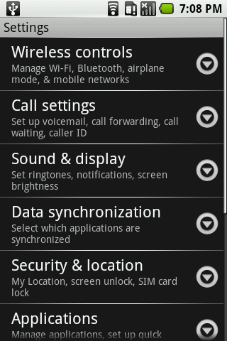
Android's Settings menu used to be a surprisingly sparse place, with an... interesting organizational logic. Options like USB debugging used to just be hanging out in the Applications section, rather than hidden away inside a secret Developer options pane. Pie may have introduced the brightly colored icons for each section, but even Froyo included monochrome icons for visual navigation. The OG was a text-only affair, and the options itself were sparse.
Dialer
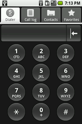
Priorities for phone use have changed a bit. The same navigation options in the dialer/phone apps are present across eras, but the default screen you were dropped to used to be the manual-entry dialer. These days the Pixels spit you to avatar-filled favorites.
Again, things look a lot more modern in Android 9 Pie, but most of the same basic features are present all the way back in 1.0. Andy Rubin, Android, and Google were nothing if not forward-thinking.
Browser
The same can't be said for the browser. Of course, these days the Pixels have moved to Chrome, but the G1/Dream and many subsequent devices used the original AOSP browser, and both the internet and the way we interact with it has changed a lot since 2008.
You actually had to enter a menu to input a URL on Android 1.0. At the time it was probably to save space — 3.2" isn't a lot of real estate. There were still tabs, though they were called "windows," and the new tab/window page on Android 1.0 simply dumped you to your home page — Google, by default. In 2018/Android P, the new tab page has your most frequently accessed sites, recent bookmarks, and even recommended content.
While in Android 1.0 you opened the browser to go somewhere, in Android 9 you can open up Chrome to find somewhere to go.
Gmail
Humorously, information density on the Gmail app seems to have dropped a bit over the years. The same overall number of emails is visible on both the 3.2" G1 and the nearly 6" Pixel 2 XL, though more information (like the first few lines of each message) is visible.
Colors and icons are all a bit more modern, but the up-front layout of the Gmail app has stayed pretty constant, for better or worse. Some might call that stability dated, but at least it's consistent.
Calculator
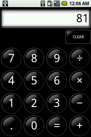
The calculator on Android 1.0 highlights the 00's tendency to skeuomorphic design. Perceived user ignorance once implied that people couldn't figure out the function of something on a screen without a real-world parallel in layout or design, resulting in the glossy-buttoned, drop-shadow screened abomination above. Designers seem to have (mostly) gotten over that pretense, though.
The Android 1.0 calculator seems a bit simpler at first glance, but it did have an "advanced" panel like its modern counterpart — accessible via the menu button or a slide across the screen — it just didn't have the immediately visible blue bar and arrow to show how to get there.
One feature was lacking from the original, however: It didn't show you the answer as you were still typing.
Calendar
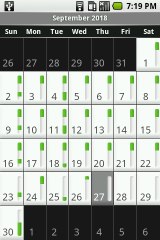
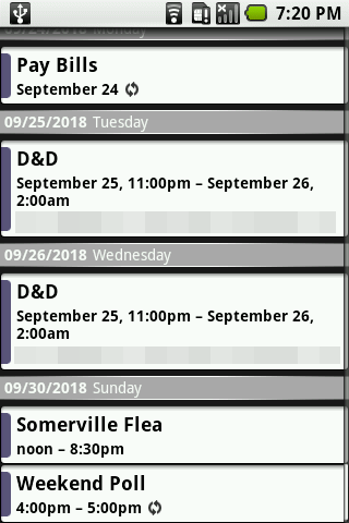
Calendar month views (above) and schedule views (below). Android 1.0 on the left, Android 9 Pie on the right.
The built-in calendar apps have taken advantage of the increase in screen size and resolution over the years. Again, the intent and organization behind the design haven't changed too much — not many new methods of calendar organization have been invented in the last decade — but the month view now has enough space to actually show off event details, rather than just a visual presentation of availability.
At-a-glance visual improvements with things like color and simple iconography also help with ease of navigation, but they're comparatively small changes.
Messaging
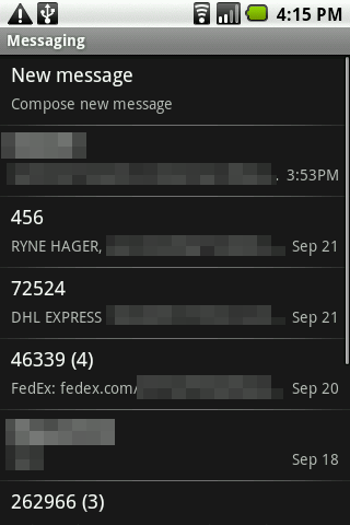
This screenshot is actually from 1.6, but other than the font, it should be close to 1.0.
Messages/messaging hasn't changed too much over the years, either. The overall aesthetic is much more modern on Android 9, especially with Google's white-obsessed redesign, but in essence, it's still just a list of per-contact conversations, as it was on Android 1.0.
All you need for a messaging app at its simplest is name, date, and message content organized in an understandable way. While there's a lot more to a good messaging app, anyone from 2018 would immediately recognize and understand how it worked on Android 1.0.
Music
This may not be a fair comparison since Play Music wasn't around back in 2008, but as the only music playback application included by default on the Pixels, it's sort of the modern equivalent — even if it's probably on its deathbed. Even so, comparing Play Music with the almost total lack of design in the original Music app is pretty hilarious.
Android 1.0's Music app felt like an afterthought, bolted-on at the last minute as a minimum visual interface for basic navigation, and a far cry from the modern bitmap and photo-filled visual experience in apps like Play Music and Spotify.
Camera
Camera app on Android 1.0 r29 (above), Google Camera on Pixel 2 XL running Android 9 Pie (below)
Although it did later get an update that added some much-needed visual elements, the original Camera app was literally just a feed from the camera. Tapping the screen did precisely nothing, the only way to take photos was via the hardware camera button, though the app did at least point you to its location when opened. In comparison, the Google Camera app is filled with a plethora of toggles, buttons, and options.
The more substantial difference in camera apps from Android 1.0 to Android 9 makes sense. Other things like a calendar or list of messages can be basically the same regardless of how you interact with them, but ten years ago cameras were nothing but buttons. Adapting all those hardware controls to fit into a single rectangle without being overwhelming is something designers are still experimenting with.
Pictures
The built-in gallery/photos apps also share basic features. Again, there are only so many good ways to do things, and if you want to look at a list of photos, a grid of previews is the simplest and most intuitive way to do that.
Google Photos on Android 9 Pie is literal magic compared to the ancient Android 1.0 Pictures app, but basic functionality is still pretty much the same in Android 1.0: you can browse saved images and photos in a chronological list, with simple options like rotation editing, deletion, and the ability to share your shots with others. There's no machine learning-powered Lens or fancy album functionality, but it's entirely usable.
Market
Left: Artist's rendition of the Market on Android 1.0. Right: The Play Store on Pie
Pardon the joke, but Android Market is dead for early Android, and our site wasn't around back then. So, unfortunately, we don't have any screenshots of the original Market to share, but I assure you it has changed quite a lot.
This is one of those things like the Camera app that hadn't been done before, so it took a while to work out how best to do it. Content discovery is a topic that a UX/UI designer could easily write a dissertation on. Thousands of apps are uploaded to the Play Store every day, and people can't just be expected to wade through a chronological listing.
Google took quite a while to figure out how best to organize and present information when it comes to apps. I'd argue their current approach, which mixes curation with dynamic recommendations across rational categories, will probably end up being pretty close to the ideal, but time will tell.
It's interesting seeing how things have changed over the years in Android visually. I didn't touch onto it due to the lack of visuals, but Android didn't even have a software keyboard until 1.5 Cupcake.
Honestly, I expected to see even more substantial differences in functionality when making a direct visual comparison of Android 1.0 to 9, but most of the changes are in design, not use. While there are very big differences when it comes to the window dressing, a surprising number of apps and functions are still pretty much the same once you get past their dated appearance.
There really are only so many ways of doing things, and while we often joke that Google likes to reinvent the wheel every few years, there's much more consistency in basic app interaction over the last decade than I thought there would be, even if plenty of the finer details are still being worked out.










Comments
Post a Comment